

- Intro Paragraph
- Headings
- Text Highlights
- Blockquotes
- Panels
- Asides
- Horizontal Rules
- Lists
- Accordions
- Hover Tabs
- Tabbed Content
- Link Buttons
- Block Callout
- Media Gallery
- Tables
- Cards
- Structural Blocks (Group, Columns, Grid, Row, Stack)
This page is a reference for every block and style available in the block editor. Browse the sections below to see what’s possible, then recreate what you need on your own pages. Each section includes a short note about when to use the block and, where relevant, the different style variants you can choose from.
Intro Paragraph
This is the Intro paragraph style, used to give extra impact to an opening sentence or two. It can serve as a tagline or short prompt for the content that follows.
Headings
Headings break a page into sections and help both visitors and search engines understand how the content is organized. Always start at Heading 2 — the page title is already Heading 1 — and follow Heading 2 with Heading 3, Heading 3 with Heading 4, and so on. Don’t skip levels, and return to Heading 2 when a new top-level section begins.
If a heading needs to look different from its actual level, don’t change the level. In the block sidebar, open the Block tab, expand Advanced, and type h1, h2, h3, h4, h5, or h6 in the Additional CSS Class(es) field. For example, a Heading 2 with the class h5 will still be a Heading 2 structurally, but will look like a Heading 5 on the page. This preserves accessibility and SEO while giving you visual flexibility. The six examples below are all Heading 3 blocks with different classes applied.
Heading 1 style
Heading 2 style
Heading 3 style
Heading 4 style
Heading 5 style
Heading 6 style
Text Highlights
Highlight short phrases with a colored background to draw the eye. Six options are available — red, green, yellow,
blue, purple, and a default highlight. Use highlights sparingly: they lose impact when overused. Apply a highlight
by selecting text and choosing Text Highlights from the formatting toolbar.
Nullam volutpat risus nec leo commodo, ut interdum diam laoreet. Sed non consequat odio.Em pé sem cair, deitado seem dormir, sentado sem cochilar e fazendo pose. Manduma pindureta quium dia nois paga.Quem num gosta di mé, boa gentis num é. Nullam volutpat risus nec leo comemodo, ut interdum diam laoreet. Sed non conseuquat odio. Em pé sem cair, deitado sem dormir, sentado sem cochilar e fazendo pose. Manduma pindureta quium dia nois paga.Quem num gosta di mé, boa entis num é. Nullam volutpat risus nec leo commodo, ut interdum diam laoreet. Sed non consequat odio.Em pé sem cair, deitado sem dormir, sentado sem cocuhilar e fazendo pose.Manduma pindureta quium dia nois paga.Quem num gosta di mé, boa gentis num é.
Blockquotes
Blockquotes set off a quoted passage, pull quote, or particularly important statement from the surrounding text.
Three styles are available, each with a different level of visual emphasis. Apply a blockquote style to any paragraph
block from the Styles panel in the block sidebar.
Standard
The default blockquote style. Use for most quoted material — interviews, testimonials, or cited passages.
Nullam volutpat risus nec leo commodo, ut interdum diam laoreet. Sed non consequat odio.Em pé sem cair, deitado sem dormir, sentado sem cochilar e fazendo pose.Manduma pindureta quium dia nois paga.Quem num gosta di mé, boa gentis num é.
Impact
Larger and more visually prominent. Reserve this style for a single high-impact pull quote per page — typically a powerful statement you want visitors to notice first.
Nullam volutpat risus nec leo commodo, ut interdum diam laoreet. Sed non consequat odio.Em pé sem cair, deitado sem dormir, sentado sem cochilar e fazendo pose.Manduma pindureta quium dia nois paga.Quem num gosta di mé, boa gentis num é.
Offset
A compact style that aligns to one side and allows body text to flow alongside it. Use for short pull quotes within a longer article, where you want the quote to sit beside related paragraphs rather than break the flow.
Mussum Ipsum, cacilds vidis litro abertis. Mais vale um bebadis conhecidiss.
Nullam volutpat risus nec leo commodo, ut interdum diam laoreet. Sed non consequat odio.Em pé sem cair, deitado sem dormir, sentado sem cochilar e fazendo pose.Manduma pindureta quium dia nois paga.Quem num gosta di mé, boa gentis num é.
Panels
Panels wrap a paragraph in a colored background to call out important information — a summary, a note, or a tip.
Seven color variants are available: default, blue-green, blue, purple, gold, green, and red. Apply a panel style from the Formats dropdown in the paragraph toolbar. Unlike Asides (below), panels span the full width of the content area.
Nullam volutpat risus nec leo commodo, ut interdum diam laoreet. Sed non consequat odio.Em pé sem cair, deitado sem dormir, sentado sem cochilar e fazendo pose.Manduma pindureta quium dia nois paga.Quem num gosta di mé, boa gentis num é.
Nullam volutpat risus nec leo commodo, ut interdum diam laoreet. Sed non consequat odio.Em pé sem cair, deitado sem dormir, sentado sem cochilar e fazendo pose.Manduma pindureta quium dia nois paga.Quem num gosta di mé, boa gentis num é.
Nullam volutpat risus nec leo commodo, ut interdum diam laoreet. Sed non consequat odio.Em pé sem cair, deitado sem dormir, sentado sem cochilar e fazendo pose.Manduma pindureta quium dia nois paga.Quem num gosta di mé, boa gentis num é.
Nullam volutpat risus nec leo commodo, ut interdum diam laoreet. Sed non consequat odio.Em pé sem cair, deitado sem dormir, sentado sem cochilar e fazendo pose.Manduma pindureta quium dia nois paga.Quem num gosta di mé, boa gentis num é.
Nullam volutpat risus nec leo commodo, ut interdum diam laoreet. Sed non consequat odio.Em pé sem cair, deitado sem dormir, sentado sem cochilar e fazendo pose.Manduma pindureta quium dia nois paga.Quem num gosta di mé, boa gentis num é.
Nullam volutpat risus nec leo commodo, ut interdum diam laoreet. Sed non consequat odio.Em pé sem cair, deitado sem dormir, sentado sem cochilar e fazendo pose.Manduma pindureta quium dia nois paga.Quem num gosta di mé, boa gentis num é.
Nullam volutpat risus nec leo commodo, ut interdum diam laoreet. Sed non consequat odio.Em pé sem cair, deitado sem dormir, sentado sem cochilar e fazendo pose.Manduma pindureta quium dia nois paga.Quem num gosta di mé, boa gentis num é.
Asides
An aside is supplementary content that sits alongside the main body — a related tip, sidebar note, or short pull quote. Asides do not replace the flow of body text; they float next to it, so the surrounding paragraphs wrap around them. Two styles are available: Panels and columns.
Panel
A colored block that floats to the left or right of body text, with text flowing around it. Six colors are available: default, blue-green, blue, gold, green, and red. Set the alignment (left or right) in the block settings.
Nullam volutpat risus nec leo commodo, ut interdum diam laoreet. Sed non consequat odio.Em pé sem cair, deitado sem dormir, sentado sem cochilar e fazendo pose.Manduma pindureta quium dia nois paga.Quem num gosta di mé, boa gentis num é.
Nullam volutpat risus nec leo commodo, ut interdum diam laoreet. Sed non consequat odio.Em pé sem cair, deitado sem dormir, sentado sem cochilar e fazendo pose.Manduma pindureta quium dia nois paga.Quem num gosta di mé, boa gentis num é.
Nullam volutpat risus nec leo commodo, ut interdum diam laoreet. Sed non consequat odio.Em pé sem cair, deitado sem dormir, sentado sem cochilar e fazendo pose.Manduma pindureta quium dia nois paga.Quem num gosta di mé, boa gentis num é.
Nullam volutpat risus nec leo commodo, ut interdum diam laoreet. Sed non consequat odio.Em pé sem cair, deitado sem dormir, sentado sem cochilar e fazendo pose.Manduma pindureta quium dia nois paga.Quem num gosta di mé, boa gentis num é.
Nullam volutpat risus nec leo commodo, ut interdum diam laoreet. Sed non consequat odio.Em pé sem cair, deitado sem dormir, sentado sem cochilar e fazendo pose.Manduma pindureta quium dia nois paga.Quem num gosta di mé, boa gentis num é.
Column
A vertical column that sits to the side of the main content flow, separate from the body text. Use for short supplementary notes — a fact, a citation, or an at-a-glance detail that complements the main paragraph.
Nullam volutpat risus nec leo commodo, ut interdum diam laoreet. Sed non consequat odio.Em pé sem cair, deitado sem dormir, sentado sem cochilar e fazendo pose.
Horizontal Rules
These are called “separators” in the block editor. Use them to create a visual break between sections. Sixteen styles are available — choose based on how prominent you want the break to be, from invisible spacing to the decorative Cornell Icon.
Default
Blue
Gold
Invisible
Dotted
Heavy
Blue Green
Purple
Green
Dotted
Double
Extra-Heavy
Faded
Section Break
Flourish
Cornell Icon
Lists
Lists organize information into bullets or numbered steps. Several ordered (numbered) and unordered (bulleted) variants are available, plus custom styles for a more distinctive look. The inline variant places list items side-by-side instead of stacked. Choose a list type and variant from the block settings in the sidebar.
Custom Ordered (inline)
- List item one
- List item two
- List item three
- List item four
Unordered
- List item one
- List item two
- Sub item one
- Sub item two
- Sub item one
- Sub item two
- Sub item three
- List item three
Ordered (default)
- List item one
- List item two
- Sub item one
- Sub item two
- Sub item one
- Sub item two
- Sub item three
- List item three
Ordered (leading zero)
- List item one
- List item two
- Sub item one
- Sub item two
- Sub item one
- Sub item two
- Sub item three
- List item three
Ordered (lowercase)
- List item one
- List item two
- Sub item one
- Sub item two
- Sub item one
- Sub item two
- Sub item three
- List item three
Ordered (uppercase)
- List item one
- List item two
- Sub item one
- Sub item two
- Sub item one
- Sub item two
- Sub item three
- List item three
Ordered (lowercase)
- List item one
- List item two
- Sub item one
- Sub item two
- Sub item one
- Sub item two
- Sub item three
- List item three
Ordered (uppercase)
- List item one
- List item two
- Sub item one
- Sub item two
- Sub item one
- Sub item two
- Sub item three
- List item three
Unordered (simple)
- List item one
- List item two
- Sub item one
- Sub item two
- Sub item one
- Sub item two
- Sub item three
- List item three
Unordered (recursive)
- List item one
- List item two
- Sub item one
- Sub item two
- Sub item one
- Sub item two
- Sub item three
- List item three
Unordered (no bullet)
- List item one
- List item two
- Sub item one
- Sub item two
- Sub item one
- Sub item two
- Sub item three
- List item three
Unordered (chevrons)
- List item one
- List item two
- Sub item one
- Sub item two
- Sub item one
- Sub item two
- Sub item three
- List item three
Ordered (simple)
- List item one
- List item two
- Sub item one
- Sub item two
- Sub item one
- Sub item two
- Sub item three
- List item three
Custom Ordered (recursive)
- List item one
- List item two
- List item three
- List item four
- List item five
Custom Ordered (large)
- Nullam volutpat risus nec leo commodo, ut interdum diam laoreet.
- Nullam volutpat risus nec leo commodo, ut interdum diam laoreet.
- Nullam volutpat risus nec leo commodo, ut interdum diam laoreet.
Accordions
Accordions hide content behind clickable headings that expand when clicked. Use them when a page has more detail
than needs to be visible at once — FAQs, program details, or anything a visitor might want to drill into selectively. Each item inside an accordion can contain any kind of content, including images and media text blocks. Four styles are available.
Default
Accordion Title
Nullam volutpat risus nec leo commodo, ut interdum diam laoreet. Sed non consequat odio.Em pé sem cair, deitado sem dormir, sentado sem cochilar e fazendo pose.Manduma pindureta quium dia nois paga.Quem num gosta di mé, boa gentis num é.
Accordion Title

Nullam volutpat risus nec leo commodo, ut interdum diam laoreet. Sed non consequat odio.Em pé sem cair, deitado sem dormir, sentado sem cochilar e fazendo pose.Manduma pindureta quium dia nois paga.Quem num gosta di mé, boa gentis num é.
Accordion Title
Nullam volutpat risus nec leo commodo, ut interdum diam laoreet. Sed non consequat odio.Em pé sem cair, deitado sem dormir, sentado sem cochilar e fazendo pose.Manduma pindureta quium dia nois paga.Quem num gosta di mé, boa gentis num é.
Compact
Accordion Title
Nullam volutpat risus nec leo commodo, ut interdum diam laoreet. Sed non consequat odio.Em pé sem cair, deitado sem dormir, sentado sem cochilar e fazendo pose.Manduma pindureta quium dia nois paga.Quem num gosta di mé, boa gentis num é.
Accordion Title
Nullam volutpat risus nec leo commodo, ut interdum diam laoreet. Sed non consequat odio.Em pé sem cair, deitado sem dormir, sentado sem cochilar e fazendo pose.Manduma pindureta quium dia nois paga.Quem num gosta di mé, boa gentis num é.
Accordion Title
Nullam volutpat risus nec leo commodo, ut interdum diam laoreet. Sed non consequat odio.Em pé sem cair, deitado sem dormir, sentado sem cochilar e fazendo pose.Manduma pindureta quium dia nois paga.Quem num gosta di mé, boa gentis num é.
Classic
Accordion Title
Nullam volutpat risus nec leo commodo, ut interdum diam laoreet. Sed non consequat odio.Em pé sem cair, deitado sem dormir, sentado sem cochilar e fazendo pose.Manduma pindureta quium dia nois paga.Quem num gosta di mé, boa gentis num é.
Accordion Title
Nullam volutpat risus nec leo commodo, ut interdum diam laoreet. Sed non consequat odio.Em pé sem cair, deitado sem dormir, sentado sem cochilar e fazendo pose.Manduma pindureta quium dia nois paga.Quem num gosta di mé, boa gentis num é.
Accordion Title
Nullam volutpat risus nec leo commodo, ut interdum diam laoreet. Sed non consequat odio.Em pé sem cair, deitado sem dormir, sentado sem cochilar e fazendo pose.Manduma pindureta quium dia nois paga.Quem num gosta di mé, boa gentis num é.
Simple
Accordion Title
Nullam volutpat risus nec leo commodo, ut interdum diam laoreet. Sed non consequat odio.Em pé sem cair, deitado sem dormir, sentado sem cochilar e fazendo pose.Manduma pindureta quium dia nois paga.Quem num gosta di mé, boa gentis num é.
Accordion Title
Nullam volutpat risus nec leo commodo, ut interdum diam laoreet. Sed non consequat odio.Em pé sem cair, deitado sem dormir, sentado sem cochilar e fazendo pose.Manduma pindureta quium dia nois paga.Quem num gosta di mé, boa gentis num é.
Accordion Title
Nullam volutpat risus nec leo commodo, ut interdum diam laoreet. Sed non consequat odio.Em pé sem cair, deitado sem dormir, sentado sem cochilar e fazendo pose.Manduma pindureta quium dia nois paga.Quem num gosta di mé, boa gentis num é.
Hover Tabs
Hover Tabs display a small set of related content side-by-side: visitors hover over a tab and the matching panel — with a heading, paragraph, and button — appears. Use for a short list of related items such as programs, audiences, or steps in a process. Three to five tabs works best; more than that becomes hard to scan.
Heading One
Mussum Ipsum, cacilds vidis litro abertis. Manduma pindureta quium dia nois paga.Quem num gosta di mim que vai caçá sua turmis!Paisis, filhis, espiritis santis.Interessantiss quisso pudia ce receita de bolis, mais bolis eu num gostis.
Heading Two
Mussum Ipsum, cacilds vidis litro abertis. Manduma pindureta quium dia nois paga.Quem num gosta di mim que vai caçá sua turmis!Paisis, filhis, espiritis santis.Interessantiss quisso pudia ce receita de bolis, mais bolis eu num gostis.
Heading Three
Mussum Ipsum, cacilds vidis litro abertis. Manduma pindureta quium dia nois paga.Quem num gosta di mim que vai caçá sua turmis!Paisis, filhis, espiritis santis.Interessantiss quisso pudia ce receita de bolis, mais bolis eu num gostis.
Heading Four
Mussum Ipsum, cacilds vidis litro abertis. Manduma pindureta quium dia nois paga.Quem num gosta di mim que vai caçá sua turmis!Paisis, filhis, espiritis santis.Interessantiss quisso pudia ce receita de bolis, mais bolis eu num gostis.
Heading Five
Mussum Ipsum, cacilds vidis litro abertis. Manduma pindureta quium dia nois paga.Quem num gosta di mim que vai caçá sua turmis!Paisis, filhis, espiritis santis.Interessantiss quisso pudia ce receita de bolis, mais bolis eu num gostis.
Tabbed Content
A simpler tab block that switches between blocks of rich text content. The Tabbed Content block is suitable for plain
text or rich content available from the classic WYSIWYG editor. Use when you want to group related paragraphs (for example, FAQ categories or short biographies) without the visual weight of the Hover Tabs block.
 Nullam volutpat risus nec leo commodo, ut interdum diam laoreet. Sed non consequat odio.Em pé sem cair, deitado sem dormir, sentado sem cochilar e fazendo pose.
 Nullam volutpat risus nec leo commodo, ut interdum diam laoreet. Sed non consequat odio.Em pé sem cair, deitado sem dormir, sentado sem cochilar e fazendo pose.
 Nullam volutpat risus nec leo commodo, ut interdum diam laoreet. Sed non consequat odio.Em pé sem cair, deitado sem dormir, sentado sem cochilar e fazendo pose. Nullam volutpat risus nec leo commodo, ut interdum diam laoreet. Sed non consequat odio.
 Nullam volutpat risus nec leo commodo, ut interdum diam laoreet. Sed non consequat odio.Em pé sem cair, deitado sem dormir, sentado sem cochilar e fazendo pose.
Nullam volutpat risus nec leo commodo, ut interdum diam laoreet. Sed non consequat odio.Em pé sem cair, deitado sem dormir, sentado sem cochilar e fazendo pose.
Link Buttons
Link Buttons are prominent call-to-action links. Four colors are available — red, blue, black, and light gray. Keep button color consistent within a single page; mix styles only when distinguishing a primary action from a secondary one.
Block Callout
A larger call-to-action block that combines an image, a heading, a short message, and a button. Use to draw visitors toward a key page or program from elsewhere on the site. Choose an image, pick whether it sits on the left or right, and pick a button color: blue, black, or red.

Media Gallery
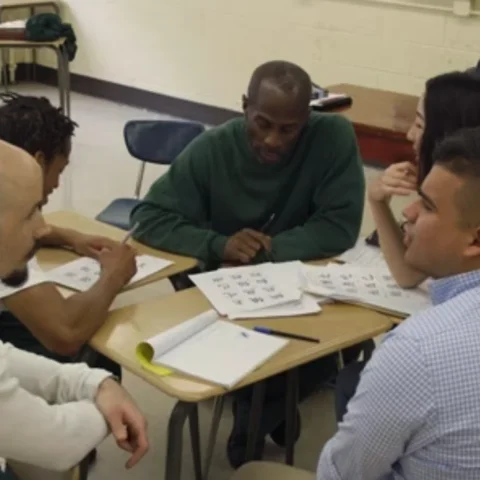
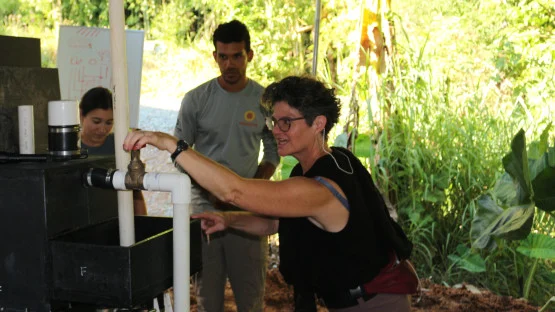
The media gallery block supports both images and videos (YouTube, Vimeo, Cornell Cast). Images used in the gallery require alternative text, and videos require caption text. Follow the instructions in the editor to ensure that all media meets accessibility standards.
The Media Gallery Title
Introductory sentence to give a sense of the section below.

















The Media Gallery Title
Introductory sentence to give a sense of the section below.
Tables
Tables display rows and columns of data. Five style variants are available; they differ in borders, row shading, and header weight. Choose based on the content — dense data tables benefit from striped rows, while smaller reference tables look cleaner flat or bordered. Always include a caption describing the table’s contents: it helps screen readers and reinforces the data’s meaning.
Default
| Column 1 | Column 2 | Column 3 | Column 4 | Column 5 |
|---|---|---|---|---|
| Cell data | Cell data | Cell data | Cell data | Cell data |
| Cell data | Cell data | Cell data | Cell data | Cell data |
| Cell data | Cell data | Cell data | Cell data | Cell data |
| Cell data | Cell data | Cell data | Cell data | Cell data |
| Cell data | Cell data | Cell data | Cell data | Cell data |
Bordered
| Column 1 | Column 2 | Column 3 | Column 4 | Column 5 |
|---|---|---|---|---|
| Cell data | Cell data | Cell data | Cell data | Cell data |
| Cell data | Cell data | Cell data | Cell data | Cell data |
| Cell data | Cell data | Cell data | Cell data | Cell data |
| Cell data | Cell data | Cell data | Cell data | Cell data |
| Cell data | Cell data | Cell data | Cell data | Cell data |
Flat
| Column 1 | Column 2 | Column 3 | Column 4 | Column 5 |
|---|---|---|---|---|
| Cell data | Cell data | Cell data | Cell data | Cell data |
| Cell data | Cell data | Cell data | Cell data | Cell data |
| Cell data | Cell data | Cell data | Cell data | Cell data |
| Cell data | Cell data | Cell data | Cell data | Cell data |
| Cell data | Cell data | Cell data | Cell data | Cell data |
Striped
| Column 1 | Column 2 | Column 3 | Column 4 | Column 5 |
|---|---|---|---|---|
| Cell data | Cell data | Cell data | Cell data | Cell data |
| Cell data | Cell data | Cell data | Cell data | Cell data |
| Cell data | Cell data | Cell data | Cell data | Cell data |
| Cell data | Cell data | Cell data | Cell data | Cell data |
| Cell data | Cell data | Cell data | Cell data | Cell data |
Flat + Striped
| Column 1 | Column 2 | Column 3 | Column 4 | Column 5 |
|---|---|---|---|---|
| Cell data | Cell data | Cell data | Cell data | Cell data |
| Cell data | Cell data | Cell data | Cell data | Cell data |
| Cell data | Cell data | Cell data | Cell data | Cell data |
| Cell data | Cell data | Cell data | Cell data | Cell data |
| Cell data | Cell data | Cell data | Cell data | Cell data |
Cards
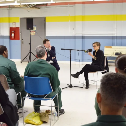
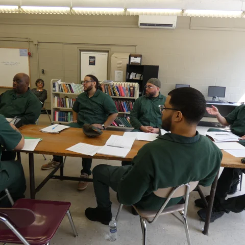
Cards pull in posts — stories, news, events, or people — and display them as previews that link to the full content. You can show the latest posts automatically, or build a single card by hand. Use cards on landing pages to surface recent or featured content without having to update the page every time a new post is published.
Grid
Displays cards side-by-side in up to four columns. Use when you want a visual, browsable layout of related posts — for example, the latest stories or a grid of people.

Stacked
Displays cards vertically, one per row. Use for news-style listings where each post needs more room for a longer title, date, or summary.


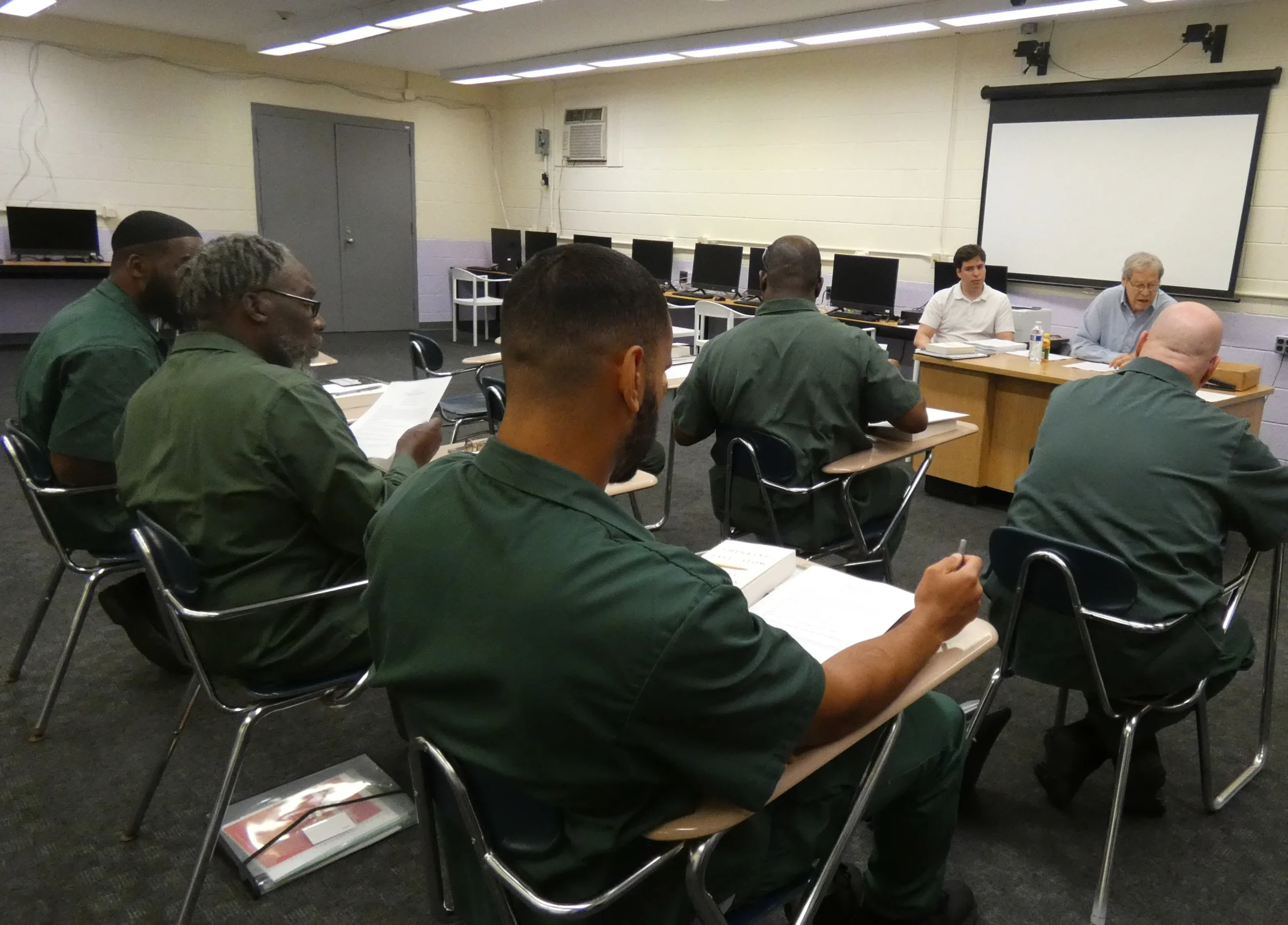
Manual Card
A single card with content you enter by hand — title, image, subtitle, badge, summary, and a link destination. Use when you want to feature something that isn’t an existing post, like a link to an external page or a program overview.